The one with an Augmented Reality app for Film Producers and Directors
AR Tour
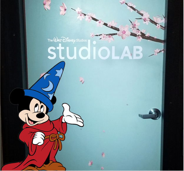
AR Tour is an Augmented Reality (AR) POC (proof of concept) application used for guiding virtual tours of Disney’s StudioLAB space to film directors and producers.

Qualitative Impact of this work
Defined UX and UI guidelines for the larger AR Project for the design team.
The designs created a roadmap for the engineering team.
The POC was used for possible creative work collaborations of Film Producers/Directors and Disney StudioLAB.
Role
As a UX Design Intern, I rapidly created AR prototypes to test design ideas. At the end, I presented a well researched, engineering friendly design solution that could be implemented in couple sprints.
Team
I was the only UX Design intern.
I worked with three teams - design, engineering and StudioLAB team.
Duration
3 months
Tools & Skills
Tools: Sketch, Miro, InVision Studio, iMovie, Adobe Premier, Keynote
Skills: User & stakeholders interviews, Contextual Inquiries, Brainstorming Ideas, Affinity Diagramming, Wizard of Oz Experiment, Personas, Mental Model, User Flows, Lo-Fi Sketches, Static wireframes, Interactive Prototypes, Usability Testings, Modular Designs, Functional Specifications.

How to impress a Film Producer/Director with AR?
Design Prompt
“We use Disney StudioLAB space to curate & showcase all emerging technologies to Film Producers, so that they can use it for their next movies.
Can you convert this tour into an AR experience? So that they can just pick up an iPad and get an AR guided tour of the space“
As Simon Sinek says, always Start with WHY - “Why this problem needs to be solved?”
In this requirement gathering phase, I gathered the goals and expectations of the stakeholders.
Design AR Demo (POC)
Define UX and UI guidelines to design for AR
I did some Investigative Research to gather ground zero information
In-depth Interview of StudioLAB Manager
I started with interviews. I tried to find out the answers to questions that would define the design scope.
Who visits the StudioLAB?
What are the roles of people visiting the StudioLab?
What is the goal of StudioLab?
What objects do they show in a typical tour?
What types of tours do they offer?
Tour of the StudioLab Space
I did a tour of the place along with the Lab Manager and asked a lot of questions.
How long are these tours?
How often do they conduct this tour?
What are they trying to improve in their current tour experience?
What happens before, during and after the tour?
What does the entire end to end experience looks like?
Contextual Inquiry
I attended a typical tour with more than 10 people.
I learned and observed -
The map of the place
The navigation flow of the tour
The questions asked during the tour
The amount of interactions people have with tour guide/object
Found Top 4 User Needs for AR Experience Design...
Affinity diagramming helped me group the various ideas into their themes. These themes were extracted out and the most important elements for designing this AR experience was discovered.
Tour - How to design the Tour Path?
Navigation - How will the user navigate in the space?
Discoverability - How will the user know where to look next?
Interaction - How will the Human-AR interaction be?
…and 3 Personas from Research Data Analysis
These where the main categories of people who would play a huge part in the design and use of the app.
Designing AR Experiences is more fun than you can imagine! 😍
My Design Vision
Disney is a storytelling company. So I decided to use an animated character of Mickey Mouse as a virtual guide.
I wanted to rapidly prototype and test my design ideas. So I did 3 design iterations & gathered user feedback.
I created the User Journey Flow and Modular Design for ease of implementation
I conducted ‘Wizard of Oz’ exercise for low fidelity prototyping.
It was a fast and easy activity to test interactions and design ideas in 3D space.
I tested my design ideas on 2 developers (to test technical capabilities of my design ideas) and 2 non-developers.
Wireframes of the AR App
As soon as the user begins the tour, they will meet the virtual tour guide - Mickey. Mickey will give a brief overview of objects to looks for.
When the user walk to an object, they can click it. The can see the name and call Mickey to explain the object. Once they complete an object, it turns green.
A timer informs that Mickey is coming to take the user to next room.
The users have a lot of options in the menu below. They can take notes and read more about the object.
There is also an option to have a bird eye view of the entire place.
Menu Drawer
Favorite Option
AR Tour Discoverability Options
After the presentation of above wireframes, the focus was shifted to build a MVP with very basic text based information display.
This was a twist in my journey. My biggest question was why should we use AR if everything needs to be text based? So I designed text based AR designs by keeping it usable.
Welcome screen
Users can favorite an object and watch video
Or they can read more about the object
Option 2: The users can read about the object like Instagram stories
Discoverability options
Option 3: Users can read about the object in this engaging way.
Findings and Learnings
What did I learn?
Testing AR Ideas
Rapidly testing AR design ideas before putting implementation efforts is crucial. I experienced the benefits of it.
Designer - Developer Pair
Throughout my design phase, I took constant feedback from developers and also asked they to test my prototypes. This ensured I’m working with the technical feasibilities.
Real World is full of constraints
After the second design iterations I was informed that although my designs are great, there were some time and budget constraints. Hence I was asked to create a text based version of the AR designs. I learned how to pivot.
What was the final outcome of my work?
Created POC
The POC that I created was being built by the developers when I left my internship.
Satisfied Stakeholders
All three teams that I worked with were happy with my work and I received positive feedback. This is a photo after my final presentation.
Defined AR UX Guidelines
I defined UX and UI guidelines for the larger AR Project for the design team.

So, I believe the Film Producers will be quite impressed with AR Experience! 😎
Do you want to check out other case studies? 😄
Salesforce - Warden AIOps
Warden AIOps is a suite of 4 products used by developers and powered by Artificial Intelligence to address performance issues on the Salesforce platform.
Focus: Systems Thinking, Complex Research & Analysis, Redesign User InterfaceOgma - Language Learning with Virtual Reality
I used Iterative UX Design process to create a VR system for learning a new language. This is a full length UX research project.
Focus: UX Research, VR Design & Prototyping


